

.webp)
What a Story team really understood our product, their videos clearly explained complex features, and the website felt clean and modern. They brought Kitaabh to life visually, and we love the collaboration throughout. A fantastic creative partner.
Kitaabh was introducing a modern accounting platform to an audience deeply familiar with traditional software such as Tally.
The product had plenty to communicate: keyboard-driven accounting, dashboards, reports, GST, audit, cloud access, AI-powered queries, and more. But a conventional feature-led explainer would make the product feel even more complicated.
Our challenge was to turn those features into clear, visual stories that showed why Kitaabh was different.
At the same time, we needed to communicate with three distinct audiences - accountants, Chartered Accountants, and business owners - without making the content feel fragmented.
Starting With Product Understanding
Before writing scripts, our team spent time understanding the product itself.
Through discovery calls with the Kitaabh team, we studied:
- How accountants use traditional accounting software
- Why keyboard-driven workflows matter to power users
- Where legacy systems create friction
- How CAs approach auditing and client data
- What business owners need from financial dashboards
- How Kitaabh handles GST, reporting, migration, and automation
This helped us identify the product stories worth showing rather than simply turning the feature list into a voiceover.
The creative direction became clear:
Show the problem. Show the product in action. Make the benefit obvious.
Building a Multi-Video Content System
Instead of putting the entire product into one long explainer, we developed a roadmap of focused videos.
Each video had a specific communication objective.
Value Proposition
The primary product story introduced Kitaabh as a modern alternative to traditional accounting software while highlighting the familiarity of its keyboard-driven workflow.
Product & Feature Videos
We created focused stories around:
- Keyboard-driven accounting
- Custom dashboards and reports
- Ledger navigation
- Performance issues
- Remote-access limitations
- GST and accounting workflows
- AI-powered queries and prompts
Problem-Solution Stories
Rather than describing problems abstractly, we built scenarios around situations users could recognize - slow reports, limited access to financial data, rigid dashboards, and the difficulty of finding answers inside large amounts of accounting information.
This gave each video a clear narrative instead of making it another software walkthrough.
Scripting Complex Accounting Into Simple Stories
Our writers worked from the discovery conversations, product material, and user pain points to develop scripts that could communicate technical workflows without overwhelming the viewer.
The structure was deliberately simple:
Pain point → Product response → Visual demonstration → User benefit → CTA
For example, instead of simply saying that Kitaabh offered customizable dashboards, the video showed users creating and arranging the information they actually wanted to see.
Similarly, the AI video focused on practical questions—expenses, customers, missing records - rather than spending time explaining AI as a technology.
The result was product communication built around what users can do, rather than what the software contains.
Storyboards That Made the Product Easy to Follow
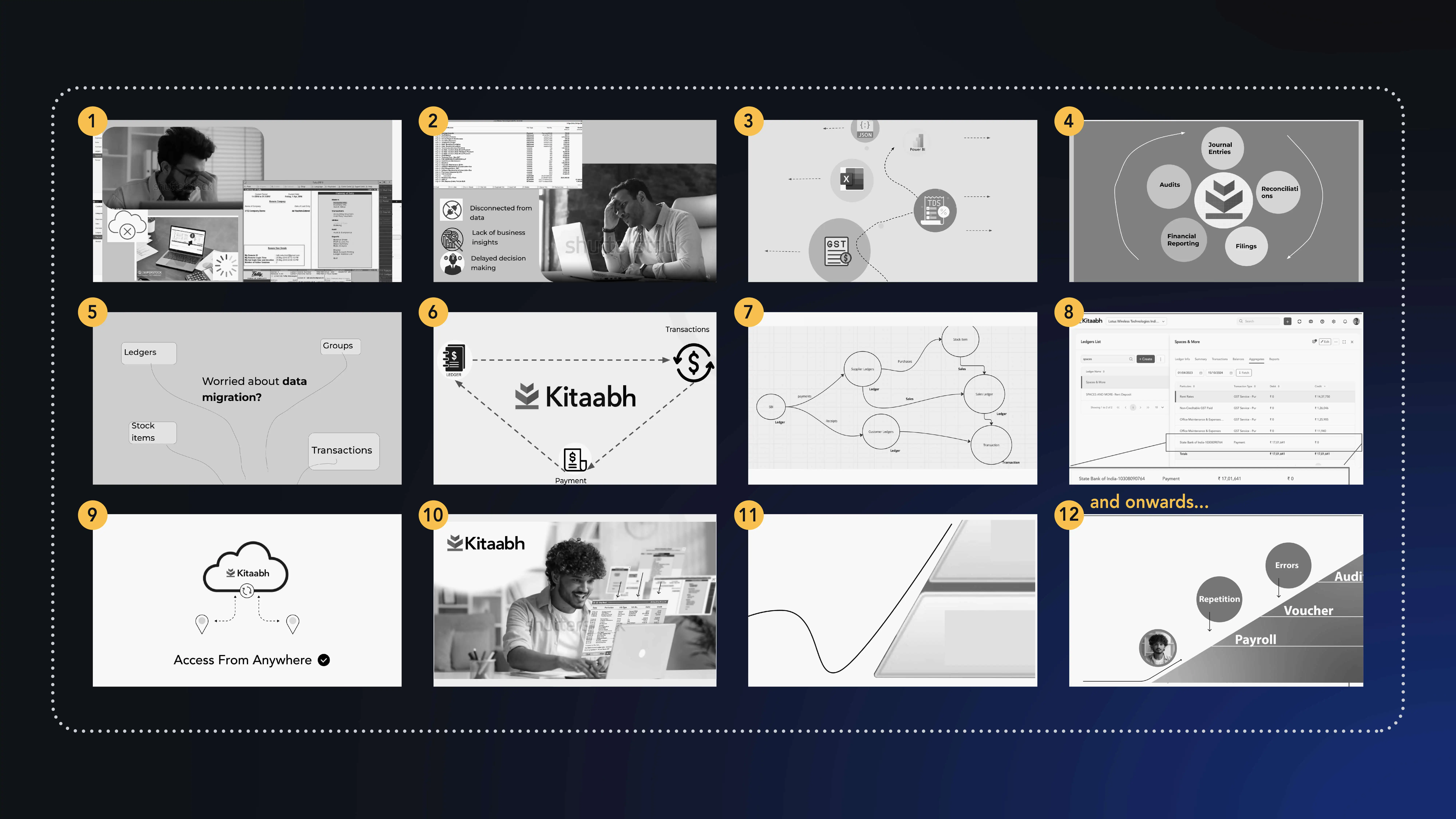
Once the scripts were approved, our storyboard team translated each concept into a visual sequence.
The focus was on:
- Clear scene-to-scene progression
- Simple compositions
- Product-led visuals
- Easy-to-follow UI interactions
- Motion that supported the message rather than distracting from it
Accounting software can involve dense screens and complex workflows. Storyboarding allowed us to decide exactly what the viewer needed to see before moving into production.
Developing Kitaabh’s Visual Language
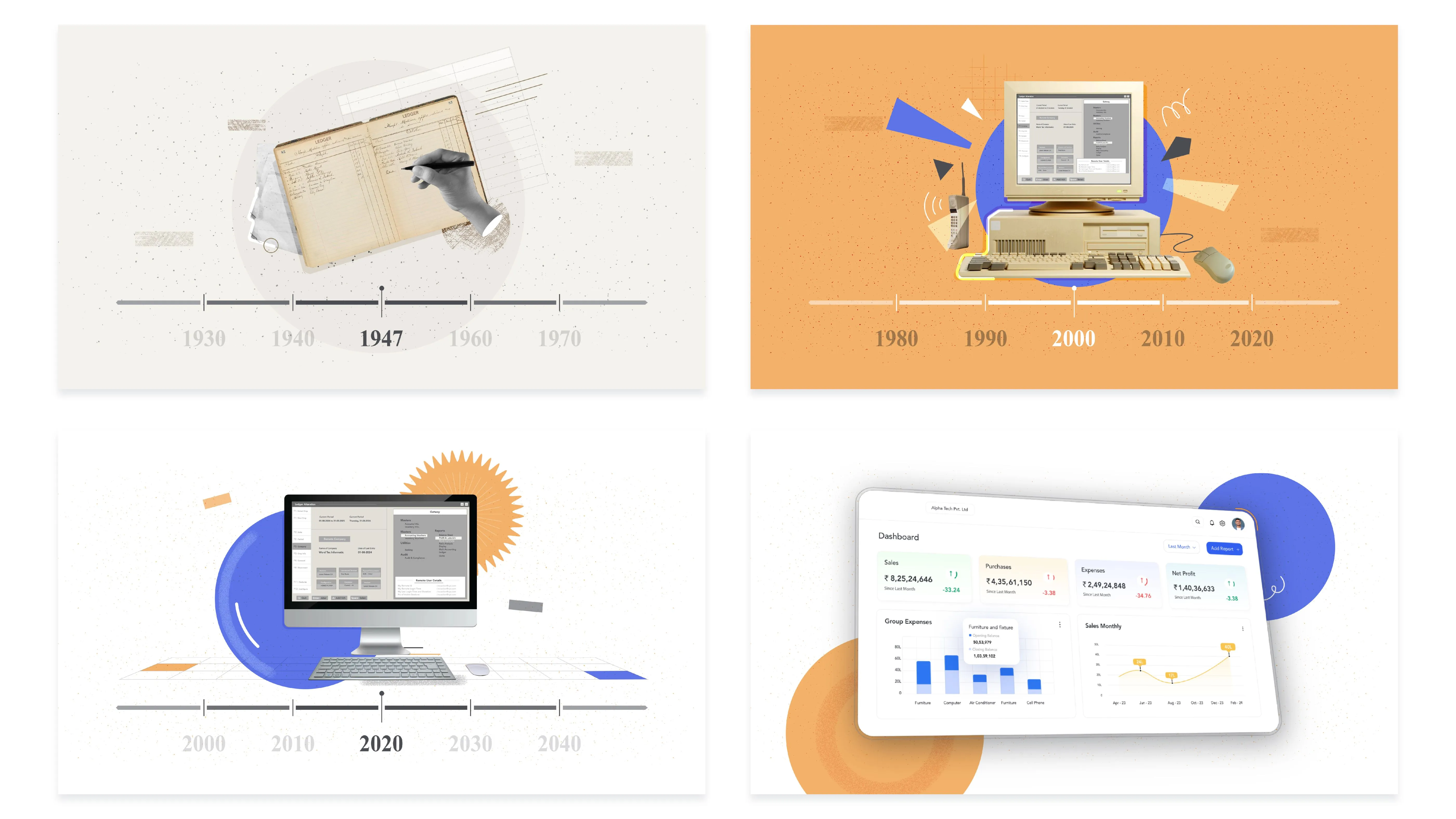
The client provided existing brand assets, colours, icons, and UI elements. We used those as a starting point while exploring how the visual system could work across the video series and digital experience.
Our designers developed multiple style directions, including:
- Light, solid-colour backgrounds
- Pastel gradient environments
- Refined iconography
- Product-focused compositions
- Motion-led UI transitions
This gave the videos a consistent visual identity while allowing individual product stories to have their own visual treatment.
Bringing Product UI Into the Animation
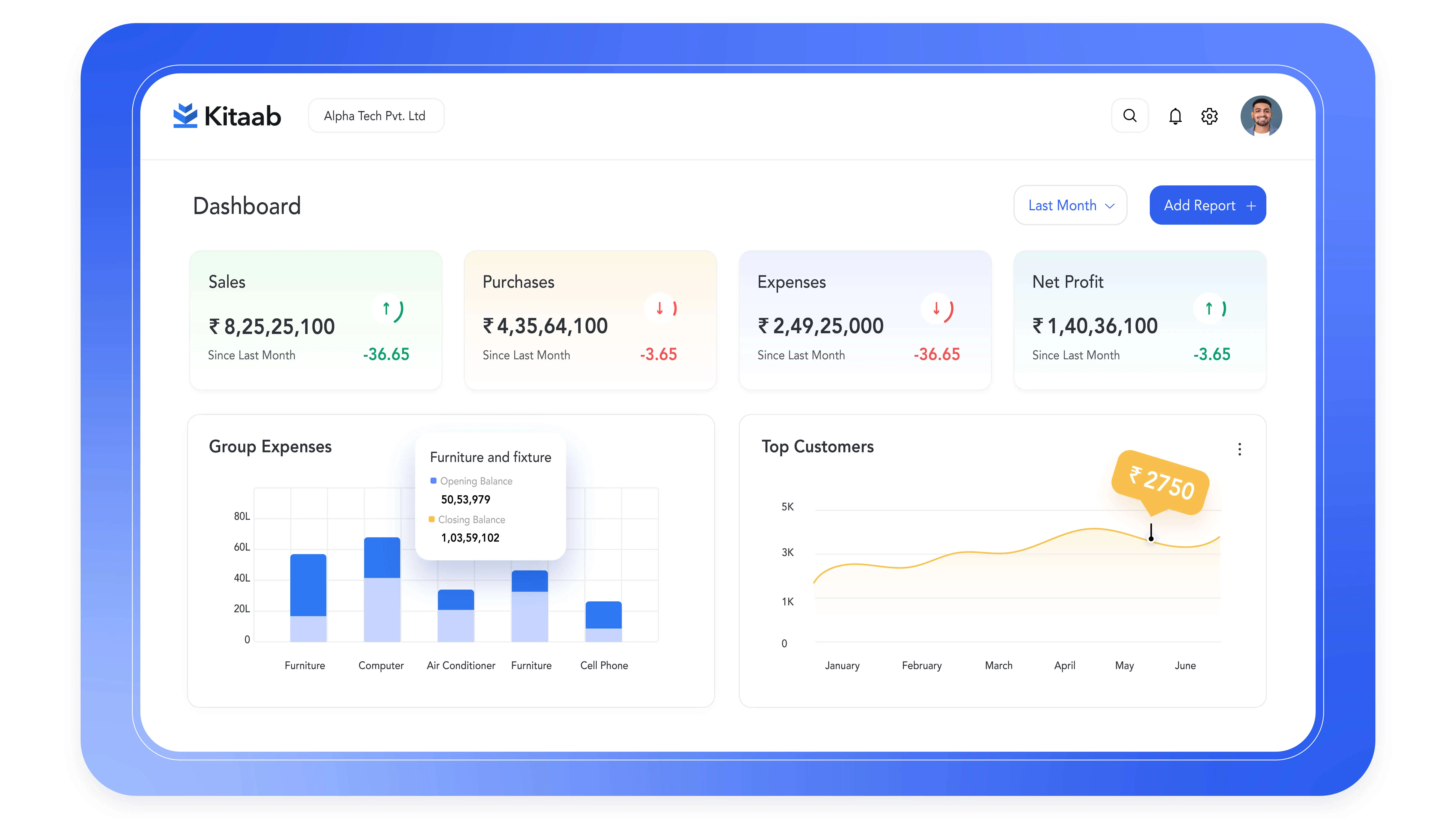
For a software product, showing the real interface matters.
We incorporated Kitaabh's UI into the videos wherever it helped explain the product experience. Animation was then used to guide the viewer through the interface and highlight the relevant interaction.
This approach helped us avoid two common problems with software videos:
A static screen recording that is difficult to follow.
An abstract animation that looks attractive but doesn't explain the product.
The final videos combined both - real product interactions with animation designed to make those interactions easier to understand.
Kitaabh’s product had several workflows and features that needed to be explained without overwhelming the viewer. We used a combination of product UI, animation, and focused storytelling to break down these workflows and show how the platform works in a practical context.
This approach follows the same principles we use in our explainer video production work - turning complex products and processes into clear, easy-to-follow visual stories.
Extending the Work Beyond Video
The engagement also extended into Kitaabh's digital experience.
Our team designed key UI elements in Figma, including:
- Feature cards
- Custom icons
- Landing page layouts
- Supporting visual elements
The objective was to carry the same clarity and visual language from the videos into the website experience.
We also created social media-focused video content and reels, allowing Kitaabh to communicate individual product benefits in shorter formats.
Complex products need more than feature lists. Kitaabh’s videos helped turn detailed workflows into stories that users could understand quickly.
Have a product that’s difficult to explain? Talk to our video production team.


